Barilla’s new visual identity i.e. the sign of innovation. We talked about it with Andrea Bandiera, creative director at Robilant, who followed the project.
The new Barilla visual identity will not have escaped the insiders, but also the simple marketing aficionados. We have previously discussed the strategies and successes of the food giant. That’s why we reached Andrea Bandiera, Creative Director at Robilant, who was responsible for the restyling of the Barilla logo and the visual identity project of the new product line.
D: Barilla’s new visual identity for the “Bronze drawn” pasta line represents a remarkable transformation. You have called it “unexpected and disruptive”. Can you tell us why?
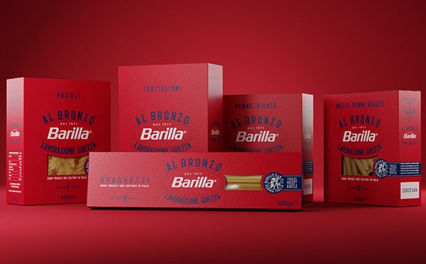
The identity of Barilla’s “Bronze drawn” product line arises from the desire to represent a new era for pasta. This is indeed a decisive step forward in Barilla’s continuous journey towards innovation and search for quality. This novelty shows the desire to mark a clear differentiation from the rest of the offer. As a matter of fact, the usual blue continues to exist in all other product lines.
Q: On our blog we talked about the importance of the briefing with the customer as a starting point for packaging design. In this project, what were the top questions you asked Barilla as your customer?
Firstly, we clarified how much they needed to differentiate Barilla’s Bronze drawn pasta from the rest of the offer. Secondly, we investigated the role of “Bronze drawn”, its communicative effectiveness in relation to foreign markets. We focused on the relationship with the brand and with the “rough processing” items. This is in fact what differentiates the new Barilla line from the other existing bronze drawn pastas. Lastly, we outlined the possibility of educating on what “bronze drawn” means in terms of processing. This is crucial above all for not so skilled pasta consumers and markets, unlike Italy.
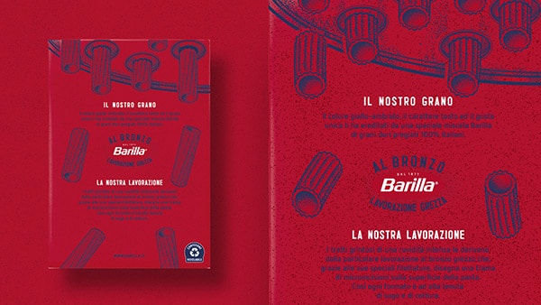
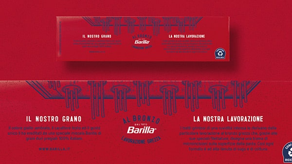
D: In the new graphics red becomes the predominant color, at a glance it is remarkable. On the shelves, the packaging will certainly stand out. Can you tell us a little more about why you chose this color and what is the message it intends to convey?
Bronze drawn features a total red. This color unmistakably marks the biggest news on the shelves around the world. The tint stems from the essence of the historic Barilla logo and then expands to the entire package. This is a metaphor for a product representing the tipping point of the company’s expertise in the art of pasta.
Q: Barilla’s packaging is increasingly on the road to sustainability. How does this concept translate to the new visual identity?
Barilla Bronze Drawn pasta currently has a cardboard pack still using the transparent plastic window. The objective here was precisely to “show” the new pasta, to highlight its quality by its distinctive look and feel already.
Within the entire product range, the largest investments in terms of sustainability concentrated on the blue line. The latter now accounts for about 90%. of production. Here the removal of the window significantly reduces the use of plastics for a total saving of about 126,000 kg per year.
Conclusions
In short: Have you reached an agreement with a customer and need to make a prototype to get the approval on the packaging design? No problem, choose the right model from the Packly library. Customize it and then share the 3D preview with few simple steps!